Thursday, March 5, 2015

What to Consider When Considering Flipping Your Classroom

Susie Kimport
 
Last semester, Fall 2014, I taught calculus in a flipped classroom environment.  Before every class, my students would watch short videos introducing the topics of the day and complete a series of online “prep-problems” for each video.  A few hours before every class, I received a computer-generated summary from our web platform of how my students did on these problems.  The hope was that I could use that data to better tailor examples and in-class activities to the topics with which my students were struggling.

This is normally how a flipped classroom is designed.  The basic idea is to take introductory material out of the classroom and instead use class time for hands-on examples and more interaction between the instructor and the students.   The main difference between my experience and that of most people who talk about flipping their classrooms is that I did not create or choose the videos for my students.  I was teaching as part of a coordinated course and it was our course director who created the videos two years ago.  This meant that I entered into the semester hoping to learn more about the flipped classroom and honestly, to be convinced that it could work, without having to invest a large amount of time into implementation.

While most of the things I noticed during the semester are specific to our implementation and our videos, I think the following three points are valuable to anyone considering flipping the classroom:

1.      Think about content. A pre-class video is another way to present material, just like lecture, demonstrations, or using props in class.

a.       There is some material that lends itself wonderfully to videos.  I loved the videos that meant I did not have to attempt (and fail) to draw 3D pictures on the board.  Many students spoke highly of the videos where the main goal was to derive a formula.

b.      But for the more conceptual ideas?  Videos did not cut it.  Yes, students could pause and rewind, but the explanation never changed.  This meant that some students came to class already extremely frustrated that “the videos didn’t teach [them] anything.” You may want to consider having an alternative explanation or teaching method on hand for difficult concepts.

2.      Think about the in-class experience just as much, if not more, than the videos. Before you flip a classroom with videos, you need videos.  In April, Simona Lorenzini and I will lead a workshop exactly aimed at creating this video content.  But once you have the videos, you have to use them!  The most important questions to ask yourself are:

a.       How do I gauge what my students have learned from these videos?  How can I leverage that to improve the in-class experience for all my students?

b.      How do I make my classroom as active as possible, so students stay engaged despite “learning” the material via videos?

c.       How can I make the constant transition between video and in-class and back again as seamless as possible?

3.      Just because students watched a video does not mean they have learned and internalized everything.  One selling point of the flipped classroom is that it removes some of the tedious lecture from class and therefore allows instructors to do more.  However, the students are not always as far along after watching the videos as you might hope.  Speaking from my own experience, I was often tempted to use the videos and prep-problems to justify (to myself) skipping some more basic examples. 

When I taught Calculus II without videos, I would do 3-4 simple examples in class with the students (let’s say level 1 or 2 for a scale).  If those went well, I would do a couple more complicated problems (say level 3 or 4 if they were really getting it). Last semester, one basic (level 1) example was in the video.  The prep-problems (usually) asked the students to do 2-3 level 2 or 3 examples.  Thus, it often felt natural to start class with a level 3 problem and then dive in to level 4 problems.

The problem with this: students often struggled through the prep-problems and (since they were online) sometimes got the correct answer without internalizing why.  Therefore, starting class at level 2 would have been a safer bet.  If that example goes off without issue, then slowly make your way up to levels 3 and 4.

Overall, I am happy that I tried the flipped classroom and would look forward to doing it again, though most likely with videos I picked out or created myself.  It is a different type of teaching and I think its value comes in how each person can adapt (or steal from) the concept to improve and critically reflect on their teaching, including taking those ideas back to a “traditional” classroom.

Thursday, February 26, 2015

Four Things I Learned about Using Webinars for Teaching and Learning

Tyler Smith

In December, CTL fellow Simona Lorenzini and I co-facilitated a pair of webinars on the use of webinars in online learning. In a post on this blog last month, Simona reflected on our planning process. We had fun and learned a ton in our preparation for and facilitation of the webinars. We got a lot of it right, too: we produced a goal-driven lesson plan and rehearsed ahead of time; we designed ice-breakers and activities to keep our participants engaged; we were punctual in starting and ending; and we accounted for digital fatigue and distractibility by keeping the meeting short and sweet. But would we do it all over again in exactly the same way? Absolutely not. In this post, I’d like to explain some of what we learned along the way.

The webinar model most people are familiar with is focused on content delivery and usually involves one or more presenters, a behind-the-scenes navigator/troubleshooter/producer, and a listening audience. Because we were working with a smaller group and wanted to mimic the seminar-style atmosphere of a typical CTL Advanced Teaching Workshop, we tried to operate in a more collaborative, interactive mode. We were surprised to find, from the post-workshop feedback we received, that the most effective and appreciated moments in our webinars happened when Simona and I were “delivering content” rather than facilitating discussion. The takeaway: Webinars work best for sharing well-defined content with a crowd.

We offered the webinar twice, each time to a group of about a dozen participants. These upper limits were partly due to the limits imposed by Google Hangouts and partly because we thought that between ten and fifteen participants would be the sweet spot for a seminar-esque conversation. We bumped up against a significant challenge, however, in that we were working with groups of people without significant shared histories. This circumstance would also have been true had we met in person, of course, but we discovered that it is more difficult to “break the ice” online than in person. The takeaway: Collaborative webinars work better for people who have a shared history.

Though Simona and I spent a lot of time crafting our learning goals and a lesson plan, our meeting was not structured around a single, collaborative task. We might have been able to get away with throwing a bunch of strangers together for a general conversation if we each had a specific role and were collaborating on a specific task, like building a website or organizing a conference. But we wanted to facilitate a general discussion about webinars—when they might be useful in teaching, and what their advantages and disadvantages might be—as well as give our participants a first-hand experience of what it might be like to participate in a collaborative webinar. The range of questions we were interested in engaging might have worked well in a seminar, but felt in this medium like waffling around without focus. The takeaway: Webinars work best for groups of people who have a single task that can be accomplished in a compact timeframe.

In the early stages of planning, the idea of discussing webinars in a webinar seemed like a fun way to model the best practices we were promoting. As we neared the event, it turned out that this was our only “Really Compelling Reason” for having this discussion online rather than in a seminar room. We weren’t in a situation where participants were geographically dispersed, nor did weather conditions, physical disabilities, travel times, or financial considerations pose obstacles to our coming together. The conversation we were having didn’t require us all to be on our computers (e.g., manipulating data on a spreadsheet or composing a jointly-authored text). Had we met in a physical classroom, though, we wouldn’t have experienced the weight of these lessons as immediately and memorably as we did. The takeaway: educators should only opt for online meetings when they can say why a webinar better suits their participants and goals than a face-to-face meeting.  

In the feedback we collected, our participants appreciated first-hand perspectives on the tools of a webinar and the immersive dynamic that wouldn’t have been possible had we simply discussed these lessons in the abstract. But a part of us also found the form and the content to be uncomfortable bedfellows. Webinars are exciting and efficient vehicles for some kinds of teaching and learning scenarios. By preparing for them, teachers are learning to be more focused, efficient, and accessible. But webinars can’t do the same kinds of reflective, interactive, relationship-building work as a seminar or a workshop, and it would be unrealistic to expect them to. This is worth remembering at a time when some entrepreneurs and proponents of online learning are pushing to “unbundle” or even eliminate bricks-and-mortar universities as loci for learning.

Thursday, February 12, 2015

Five Secrets for Creating Effective Slides

Namratha Vedire

From cave paintings and hieroglyphics to modern day video conferencing, human beings have invented different ways to communicate visually with each other. In today’s technology saturated world, PowerPoint presentations have become the most commonly used method to visually convey ideas. Unfortunately, their pervasiveness has also made PowerPoint the most abused tool. Thanks to inbuilt templates and the largely design-agnostic masses, we not only tolerate but have come to accept badly designed presentations. Not surprisingly, skeptics and cynics commonly label it a crutch. As teachers, academics and researchers, we lean quite heavily on this crutch. And even worse, accept poorly designed presentations as the norm.

As an engineer, and a theorist at that, I have sat through my fair share of classes and talks featuring downright bad presentations. Yet, I firmly oppose the idea of labeling PowerPoint as a crutch and refuse to put up with poorly designed slides anymore. I believe that when used well, the simple constructs that PowerPoint provides can create powerful and moving presentations. Don’t believe me? Al Gore’s Academy Award winning documentary film “An Inconvenient Truth” is an adapted and edited version of his PowerPoint presentation. Now, you and I might not have Mr. Gore’s resources when it comes to creating our presentations, but there are a few global design principles you can use to make your slides stand out.

In this blog post, I have limited myself to 5 ideas to make your slides compelling, which are easy to adopt when making new presentations or editing those already built.

1. Ideate - Finding Non-Cliché Images

A picture is worth a thousand words. But, we rarely look beyond PowerPoint’s inbuilt clipart gallery full of cliché images like the one below showing a baton being handed off for, say, teamwork. Even if we do turn to Google images for fresh visuals, it is often hard to cull the plethora of search results for an image that fits our need. For instance, consider that you need to replace the cliché teamwork image. Before you even open your browser to find an image, employ a method called Ideating.


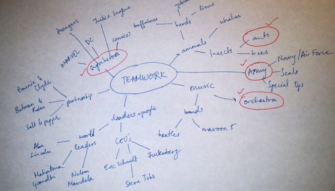
Ideating is a way to systematically brainstorm and open your mind to different possibilities by listing all words/phrases/analogies you can think of for your key word; here our key word is “teamwork.” Below is one instance of me ideating for teamwork.


From the above process I could now choose a picture of ants or an orchestra or a team of superheroes—say, the Avengers—as my stand-in for the cliché image depending on what works best for my presentation. Now I can turn to Google and find a focused, copyright-free image. I chose ants and I particularly liked this image.


2. Data

There are three cardinal rules while designing a data slide:

i. Pick the right tool for the job.

Determine what relationship your data portrays and then choose the tools that highlight that aspect. Some examples:


ii. Highlight what is important.

Use differentiating colors or animation to highlight the important data points/ deviations from the standard. This is a much better tool than relying on your laser pointer to draw focus because there are no uncertainties with runaway pointers. It is controlled and you already know how it will play out.

iii. Tell the truth.

I cannot stress this enough—ALWAYS TELL THE TRUTH. Use the above two points to tell the truth and communicate effectively the point you wish to make.

3. One Message per Slide

Limit yourself to conveying one message (concept/ idea) in a slide. While it is okay to have overview slide to introduce your talk or section, keep to one concept in the slide. Strictly enforcing this rule should stop you from putting too much text, graphs, images or all of them on one slide.

4. Use Relationships

After isolating the one message you want to show in the slide, it is important to represent the message clearly. All I want to say on the subject, I learnt with http://www.duarte.com/diagrammer.

5. Slide Master

If you are a certified PowerPoint expert, you still might not be aware of all the handy features of PowerPoint’s Slide Master. The Slide Master is the global slide that can control Font, Color Scheme and Layout of all your slides at once. Anything you add (remove) here appears (disappears) on every slide – think logos, background color, header and footer. Learn more about accessing and editing your slide master here.

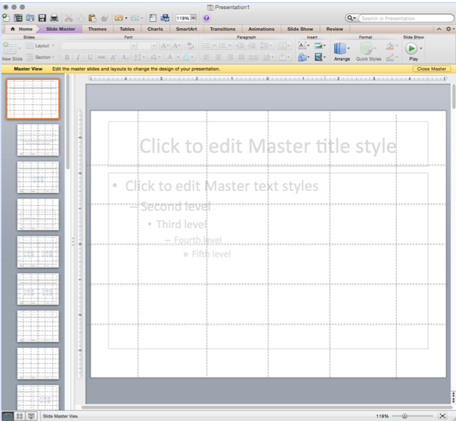
Once in the slide master view, in addition to adding global visual elements, consider adding a grid to help keep a uniform layout for your slides. Create the grid using the line tool in PowerPoint. Once you are done creating you slides, just delete the grid from the master and you are left with a consistent presentation. Explore more layout options here. As an example, I created this grid:


Setting your color scheme and choosing your font and font size is easy with the slide master. When choosing colors, keep in mind that some of your audience might be colorblind. Make sure there is enough contrast between your background and main text/ images. For color inspirations, check out paletton.

For fonts, there are a lot of options and, as I have come to realize, the choice is very personal. In addition to setting theme fonts, the master slide is a great place to delete the second, third, fourth and fifth levels of text (bullet) indents so you don’t use them to make text heavy slides. To enhance the clarity of your text, err on keeping the size medium to big. A rule of thumb to know when your text size is too small, step 2.5 feet away from your computer and if you cannot read the text – it is probably too small. For inspirations, look at fonts here.

It is important to remember that just like any other software package, PowerPoint is only as powerful as you make it. This post was written with the intent of making you aware of tips and tools to push PowerPoint’s effectiveness and enable you to create powerful presentations.


Thursday, February 5, 2015

Putting the "Active" in Active Learning

Becky Van den Honert

Think of a few of your worst classes in high school or college. What made them so awful? What about your favorite classes? Why did you love them? When I think back, I remember professors that showed their passion for the material, challenged me to think in a different way, and didn’t just regurgitate facts from a textbook.

Today, I am a Psychology PhD student. I’m studying how your brain makes memories, so the topic of what helps people learn is near and dear to my heart. Lately, I’ve been thinking a lot about “active learning” and why it seems to work so well. Defined broadly, active learning is an approach to teaching that engages students through reading, writing, discussion, problem solving, and other sorts of activities. Almost by definition, a lecture does not fall into this category. This is where I start to get uncomfortable. Some of my all-time favorite classes have been lecture-based. Is it really the case that classes based on active learning are better than those fantastic lectures? I don’t think so.

Why do certain lectures work very well and others don’t? It has to do with why I think active learning approaches are so effective.

Below are three major factors that will improve students’ retention of information.

1.     Engagement. Students have to pay attention and fully process information they encounter in order to remember it.
2.     Integration. In order to learn, students must integrate new information into things they already know. Having a way to organize information is what turns it into knowledge.
3.     Remembering. Merely being reminded of something by hearing or reading it again will do very little to improve a student’s memory. Instead, if they voluntarily remember something (e.g., by quizzing themselves), they’ll be better able to use that information down the road.

Active learning capitalizes on all three of these things.

An activity is likely to boost students’ engagement in a number of ways. Maybe they wake up a bit by having to interact with other students. Maybe they see a real-world application and so are motivated to pay attention. Maybe the activity requires that they process some information more deeply than they would if you just told them a list of facts. But a good lecture can do all of these things too. A good story told in a history class, for example, can wake you up, can make you see real-world applications, and can be thought-provoking enough to make you process the lecture in a deep way.

A well-designed activity can also help students integrate new information with what they already know. Maybe they are forced to make connections to last semester’s material? Maybe they’re asked to relate what they’ve learned to their daily life. But again, a good teacher can organize and deliver their lecture in a way that makes you do this in your own mind.

Finally, an activity might help students remember information that they wouldn’t otherwise think of on their own. Maybe they’re asked questions that force them to recall the lessons from last week? Maybe the activity reinforces something they just learned. You won’t be surprised, now, when I say that a lecture can accomplish the same thing. Don’t forget, lecturers can pose questions. They can even support a small amount of discussion.

I worry that the phrase “active learning” makes us forget that what counts is that students’ minds are what are active. An activity that doesn’t increase engagement, integration, or remembering will be as ineffective as a boring speaker. It might just be that including certain activities in a class is among the easiest ways to create an active mind.

So take heart if you get nostalgic when you think of your favorite teachers who “just lectured.” They weren’t doing anything wrong, they were just exceptional at teaching the traditional way.


Wednesday, January 28, 2015

Building Meaningful Mentoring Relationships


Ian Althouse

At the CTL this semester, I have the opportunity to run a workshop alongside my co-facilitator Stuart Duncan in which we will explore a teaching fellow’s role beyond the classroom. One of these roles can and likely will be developing a mentoring relationship with our students and that’s what has inspired this blog post that you’re reading now!

In preparation for this workshop, I wanted to see what others had been saying about mentoring especially as it pertained to academia. As it turned out, the last few years have seen much discussion of mentoring in academia. Time and again, authors discussed the same two questions: how does one mentor well, and how does one become a mentor? From this pair of questions, there has even arisen a debate about what we mean when use the word mentor. Are we discussing an active verb, to mentor, or an inactive noun, a mentor?
           
I want to think about that debate for a moment. If we conceive of mentoring as a verb, that puts a lot, if not all, of the agency in the hands of the mentor. This idea gives me pause because it turns the mentee into a passive recipient of the mentor’s guidance. Shouldn't our mentees be active learners? And yet, I don’t believe an effective mentor can ever be, like a noun, entirely inactive.
           
In the end, what I concluded was that trying to define this word as noun or verb was insufficient. Mentor is too rich a word. We need to embrace that mentor can be either active or inactive as the situation demands. A student seeks out his or her mentor. In this, the mentor is inactive. However, once in the role of mentor, the mentor transforms into an active participant in the mentee’s life.

But if we can’t solely discuss mentoring as a verb, and if agency in this relationship is divided between mentors and mentees, how do we become mentors? If students need to seek us out, we need to show that we are ready and willing to be found. That means we need to be approachable. We need to show them that we are here, we are present, and we are listening.

So, as I read through various articles, I compiled a list of the things that we, as teaching fellows or as professors, can do or keep in mind to show our availability in fostering meaningful mentor-mentee relationships:
·      Chatting with students: This may not always have to do with academics and may not be a formal meeting in your office, but consider accompanying a student to their next class to continue a conversation or grab a coffee with them one afternoon.
·      Confidence, trust, and unanxious expectations: Your mentee needs to find that they feel these elements in their relationship with you; working or meeting with you should not be cause for added stress.
·      Commitment: Following up with students and following through on your word shows your investment in your mentee.
·      Seeing the student holistically: They are not just students in your class, but people with a host of factors affecting their lives.
·      A student-centered relationship: It’s easy to tell a student your opinions, but mentoring really happens when we listen to our students and help them hear themselves.
·      A collaborative and dialectical relationship: We as mentors must try to learn from our mentees just as they are learning from us—what do they need and how do they work?
·      Time: It takes time to mentor someone, so you’ll need to put time into getting to know your mentee.
·      Cyclical: Good mentors inspire new generations of good mentors.

We consistently see in course evaluations that those instructors who genuinely noticed and paid attention to a student stood out and often factored into a student’s reflections on the university as a whole. What this shows us is that when our students look for a mentor, they are looking for a genuine connection with another person who they trust, respect, and admire. Students are searching for authentic interpersonal relationships everywhere on campus. Our students are seeking connections to people and these relationships are the memories students will carry with them for a lifetime.

If you are interested in reading more about why we should mentor, the state of mentoring in academia, and other instructors’ experiences, I would encourage you to take a look at some of the following links:


Adviser, Teacher, Role Model, Friend: On being a mentor to students in Science and Engineering. National Academy of Sciences. Washington, D.C.: National Academy Press, 1997.

Thursday, January 22, 2015

What's Exciting about Course Design?


Eleonora Buonocore

As a teacher and a graduate student, there is nothing that is more exciting to me than the  possibility of designing my own course. I think many of you will agree! We are here because we love to research and to teach, and designing a new class represents the perfect occasion for merging together the two things we love the most.

This is what draw me to course design: I wanted to become good at creating and developing new and exciting courses for my students. I attended an Advanced Teaching Workshop at the Yale Teaching Center on Course Design back in 2013, and since then I started researching techniques for course design, trying to understand what makes an effective course and how to recreate it. This led me to design my own course and then to propose it as part of the Associates in Teaching (AT) program, for which it was approved in the spring of 2014. Co-teaching a new course that my advisor, Prof. Giuseppe Mazzotta, and I had designed from the very beginning was an exhilarating experience. We used all of the good practices I learned on Course Design: we began with our goals, designed to be student-centered and focused on active-learning objectives; then we created assessment methods that would reflect our goals; and finally, we selected the best material to match our goals and our assessments. We paid particular attention to varying instructional techniques and to appeal to different kinds of learners: each class period included both a PowerPoint presentation, a reading of the text, a student’s presentation and a student-led class-wide discussion. The course was a success, and the students seemed to enjoy it a lot.

I used my AT experience as a way to stress the possibilities that course design opens up to us. When you put time and effort in designing a course, the students notice it!

But it wasn’t until last semester, when I had the opportunity to run an Advanced Teaching Workshop with my co-facilitator Robert Wickham, that I discovered the full potential of Course Design. Specifically, I understood how its core competencies can be applied to all sorts of disciplines, spacing from the humanities to sciences and the social sciences. It was an eye-opening experience, since I could finally see with my own eyes in action what I always instinctively knew: that good teaching techniques are independent from the discipline you are teaching, and that they are not simply innate skills, but can be learned and reproduced. In short, I learned that you can teach how to teach, and specifically how to design a successful course.

If you were unable to come to our workshop, don’t fret! I will quickly summarize here the most important points that we covered during our workshop…

1. Familiarize yourself with the principle of Backward Design: how to design a class starting from your goals and not simply from the material you want to cover. You can find more information on Backward Design here.

2. I cannot stress enough the importance of goal-setting: set goals for your course at the start, and then set specific goals for each class period. What makes a goal good?  Objectives should be specific, clear, and measurable. In particular, it is useful to formulate your goals in an active-learning and student-centered language. Active verbs help!

3. Understand what possibilities are available as assessments (both formal and informal) for your course, and how your choices in assessment should reflect your goals and should correspond to your choice of materials. On available assessment methods, you can find a list of Classroom Assessment Techniques (CAT) here.

4. Finally, take your time to create a course schedule and to develop an appropriate syllabus! Course design is a time-consuming activity that also requires some breathing time in between the initial idea, the planning stage, and the finalized syllabus creation.

Oh, and there are plenty of resources available online on the subject of course design, so do not forget to check the links offered below:

On goal-setting for your course check out this website from University of Berkeley:

On Backward Design, check out this evaluation and summary of the excellent book Understanding by Design, by Grant Wiggins and Jay McTighe:

On aligning your assessment methods with your goals, see this website by Carnegie Mellon University:

For a complete guide to course design, consult University of Vanderbilt Center for Teaching website here:


Thursday, January 15, 2015

Webinar on Online Learning and Teaching: A Reflexive Autobiography


Simona Lorenzini

December 3, 2014 marked my debut online. For the first time the Yale Center for Teaching and Learning offered an Advanced Teaching Workshop in a webinar format that I co-facilitated with my fellow Tyler Smith. Webinar: what is it? A friend of mine has suggested this definition: a seminar on the web. I think is the simplest and straightforward definition for a webinar. Personally, I only heard about webinars for the first time a few months ago when I started being interested in online education. As both teacher and researcher, I like challenging myself with new tools and resources and, following my curiosity, I have come across the virtual world of webinars. There is a mare magnum of webinars: you can find a webinar on almost anything, from education to marketing, from technological to cooking tutorials. And many of these webinars are completely free—a feature that speaks to the high level of “democracy” of such tools.

As a Yale Online Teaching Fellow, I had to take some webinars as part of my training for the webinar Tyler and I co-facilitated in December. I have to say that my first experiences with webinars were somehow discouraging. Even if the topic was of interest (mainly about education), I often felt overwhelmed by the content’s delivery. Many of these webinars were lectures of one or two speakers, with one person acting as moderator. After half an hour of talking and slide sharing – when you cannot actually see the speaker – my attention flagged and I started watching time, looking around, and eventually getting distracted. So, when it came to plan our webinar, Tyler and I agreed in approaching it as a traditional CTL workshop. That meant to keep it as interactive, dynamic, and engaging as possible. For me, this was the most challenging part of the webinar. You cannot have a sense of the importance of a physical interaction with the audience until you lack it. In a face-to-face environment, you can easily measure the level of attention of your audience and bring it back by eye contact, direct questions, or just simply by moving around the physical space. However, in a virtual space, everything becomes more difficult. So, the first thing to keep in mind was avoiding a lecture-style webinar. We did not want to lecture our participants about webinars and online learning. Instead, we presented ourselves as facilitators for a discussion about the costs and benefits of online teaching, and we started our webinar with a very successful icebreaker that asked our participants to share their previous experiences with online tutorials. The answers varied from ‘how to tie a bow’ to ‘how to fix a leaking faucet’; this way, we were able to put our participants at ease and open a discussion without presenting ourselves as “experts.”

Going through all the aspects of a webinar (from technical to pedagogical issues) was challenging and rewarding at the same time. I experienced the entire procoess as a learning experience for myself, strongly believing that doing something is the best way to learn something (a pearl of wisdom that comes from my parents).

And so the question arises: what did I learn? Here are my “pearls of wisdom” for developing and conducting a good webinar:
  • Surf the net: you will find tons and tons of tutorials, tools, and materials (free!!) on the web. It is a good starting point, especially if you are a newbie.
  • Choose the right platform: Google Hangout and Skype are just some of the platforms you can use for hosting a webinar. The good news: they are free. The bad news: they can allow a limited number of participants. Here you can find a list of the most reliable webinar platforms: http://webinar-services.no1reviews.com
  • Learn the technology and become familiar with the platform: before the December webinar, I used Google Hangout in many pre-webinar meetings and with my family to become accustomed with tech troubleshooting and interactive apps.
  • Work in a team: a successful webinar is often a team project. Even if you are the only facilitator/presenter, it is a good practice to ask for suggestion and help to your colleagues or friends. They can help you with resources, feedback, tech support, and rehearsals.
  • Rehearse: before the event, you should rehearse with colleagues and/or friends (maybe from the same location and at the same time of your real event) to be sure that everything will go smoothly, and to allow yourself to feel confident with virtual interactions.
  • Have a good lesson plan: you should set your goals and expectations from the very outset. This way the participants can follow you easily and be more focused.
  • Treat your webinar like a face-to-face event/workshop: maybe it is the most challenging part because you miss the physical contact with your audience, and you cannot control its attention. But if you do not lose your participants along the way, you must remember that they are there. So…
  • … engage your audience: you should avoid lecturing-style webinar by thoughtfully dividing your time between content delivering and interactive learning activities. Interactivity is a good strategy to promote engagement and attention; and engagement is fundamental for a successful webinar.
  • Use the chat function to share documents/worksheets, website resources, and links with your participants: the chat app is an excellent tool for live Q&A, small group activities, video clips, and feedback. And last but not least…
  • Keep it simple and short: especially if it’s your first experience with a webinar, do not entrap yourself in those cool apps that some platforms allow. Instead, go straight to your goals, deliver not more than two or three topics, and engage your audience in a lively discussion and interactive activity for no more than 50 mins.

The webinar tool is a very flexible technology and it can respond to different specific communicative purposes. It also allows you to break down time and space barriers, making it a more suitable choice in this age of tight schedules. At the same time, missing visual and bodily cues poses a challenge. In my personal experience, facilitating active participation and preventing participants’ distractions were the hardest obstacles to overcome. In a traditional f2f workshop, you can split your participants in small groups (even in pairs), easing the anxiety of talking in front of a large group. That is harder to accomplish in a virtual setting. Of course, you could call on people to speak, but the majority of them could not feel comfortable in being on the spot. This downside of the webinar was counterbalanced by the high appreciation and usage of the chat tool that, surprisingly or not, played an important part in our webinar.

Being an online teacher/presenter is demanding, challenging, and overwhelming in terms of lesson planning, setting clear goals, keeping your audience attentive. However, in the spirit of the CTL’s workshop, I found the December webinar on online teaching to be a stimulating learning experience that I had the privilege to share with my co-facilitator, with the staff of CTL, and, of course, with all of our participants whose precious feedback serves as a helpful tool to rethink and reshape future online workshops.

To my readers: Have you ever taken a webinar? Would you like to take one? I would really enjoy hearing your thoughts and experiences in the comment section below.