From cave paintings and hieroglyphics to modern day video conferencing, human beings have invented different ways to communicate visually with each other. In today’s technology saturated world, PowerPoint presentations have become the most commonly used method to visually convey ideas. Unfortunately, their pervasiveness has also made PowerPoint the most abused tool. Thanks to inbuilt templates and the largely design-agnostic masses, we not only tolerate but have come to accept badly designed presentations. Not surprisingly, skeptics and cynics commonly label it a crutch. As teachers, academics and researchers, we lean quite heavily on this crutch. And even worse, accept poorly designed presentations as the norm.
As an engineer, and a theorist at that, I have sat through my fair share of classes and talks featuring downright bad presentations. Yet, I firmly oppose the idea of labeling PowerPoint as a crutch and refuse to put up with poorly designed slides anymore. I believe that when used well, the simple constructs that PowerPoint provides can create powerful and moving presentations. Don’t believe me? Al Gore’s Academy Award winning documentary film “An Inconvenient Truth” is an adapted and edited version of his PowerPoint presentation. Now, you and I might not have Mr. Gore’s resources when it comes to creating our presentations, but there are a few global design principles you can use to make your slides stand out.
In this blog post, I have limited myself to 5 ideas to make your slides compelling, which are easy to adopt when making new presentations or editing those already built.
1. Ideate - Finding Non-Cliché Images
A picture is worth a thousand words. But, we rarely look beyond PowerPoint’s inbuilt clipart gallery full of cliché images like the one below showing a baton being handed off for, say, teamwork. Even if we do turn to Google images for fresh visuals, it is often hard to cull the plethora of search results for an image that fits our need. For instance, consider that you need to replace the cliché teamwork image. Before you even open your browser to find an image, employ a method called Ideating.

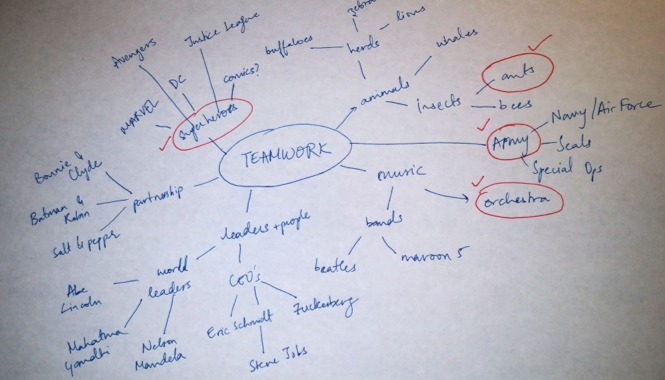
Ideating is a way to systematically brainstorm and open your mind to different possibilities by listing all words/phrases/analogies you can think of for your key word; here our key word is “teamwork.” Below is one instance of me ideating for teamwork.

From the above process I could now choose a picture of ants or an orchestra or a team of superheroes—say, the Avengers—as my stand-in for the cliché image depending on what works best for my presentation. Now I can turn to Google and find a focused, copyright-free image. I chose ants and I particularly liked this image.

2. Data
There are three cardinal rules while designing a data slide:
i. Pick the right tool for the job.
Determine what relationship your data portrays and then choose the tools that highlight that aspect. Some examples:

ii. Highlight what is important.
Use differentiating colors or animation to highlight the important data points/ deviations from the standard. This is a much better tool than relying on your laser pointer to draw focus because there are no uncertainties with runaway pointers. It is controlled and you already know how it will play out.
iii. Tell the truth.
I cannot stress this enough—ALWAYS TELL THE TRUTH. Use the above two points to tell the truth and communicate effectively the point you wish to make.
3. One Message per Slide
Limit yourself to conveying one message (concept/ idea) in a slide. While it is okay to have overview slide to introduce your talk or section, keep to one concept in the slide. Strictly enforcing this rule should stop you from putting too much text, graphs, images or all of them on one slide.
4. Use Relationships
After isolating the one message you want to show in the slide, it is important to represent the message clearly. All I want to say on the subject, I learnt with http://www.duarte.com/diagrammer.
5. Slide Master
If you are a certified PowerPoint expert, you still might not be aware of all the handy features of PowerPoint’s Slide Master. The Slide Master is the global slide that can control Font, Color Scheme and Layout of all your slides at once. Anything you add (remove) here appears (disappears) on every slide – think logos, background color, header and footer. Learn more about accessing and editing your slide master here.
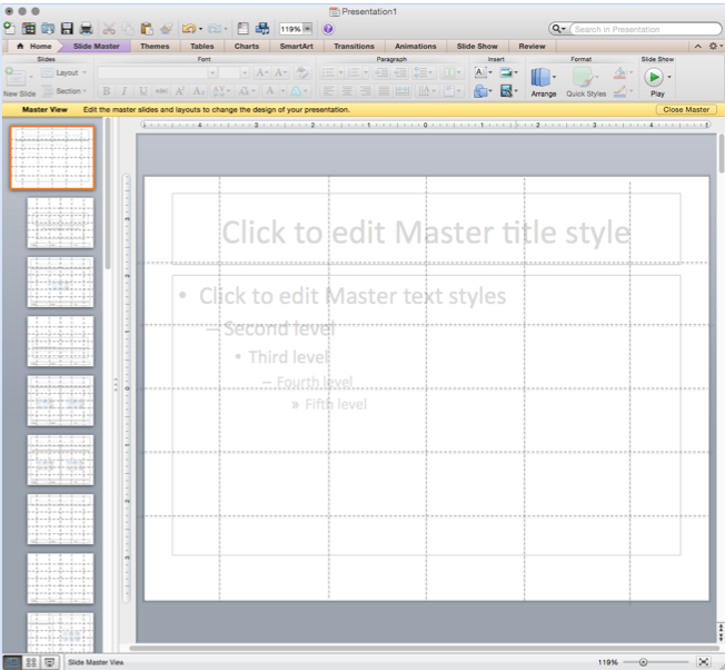
Once in the slide master view, in addition to adding global visual elements, consider adding a grid to help keep a uniform layout for your slides. Create the grid using the line tool in PowerPoint. Once you are done creating you slides, just delete the grid from the master and you are left with a consistent presentation. Explore more layout options here. As an example, I created this grid:

Setting your color scheme and choosing your font and font size is easy with the slide master. When choosing colors, keep in mind that some of your audience might be colorblind. Make sure there is enough contrast between your background and main text/ images. For color inspirations, check out paletton.
For fonts, there are a lot of options and, as I have come to realize, the choice is very personal. In addition to setting theme fonts, the master slide is a great place to delete the second, third, fourth and fifth levels of text (bullet) indents so you don’t use them to make text heavy slides. To enhance the clarity of your text, err on keeping the size medium to big. A rule of thumb to know when your text size is too small, step 2.5 feet away from your computer and if you cannot read the text – it is probably too small. For inspirations, look at fonts here.
It is important to remember that just like any other software package, PowerPoint is only as powerful as you make it. This post was written with the intent of making you aware of tips and tools to push PowerPoint’s effectiveness and enable you to create powerful presentations.
Awesome Article. Very detailed. Thanks !!!
ReplyDeletePokerStars Casino: Play online casino games for real money at
ReplyDeleteJoin PokerStars kadangpintar Casino today and get $1000 deposit match bonus. Play slots, blackjack, choegocasino roulette, 1xbet korean keno and much more.